Showing posts with label Paul Gilfoyle. Show all posts
Showing posts with label Paul Gilfoyle. Show all posts
Saturday, 4 February 2012
The Automatic - Monster Final Cut
This is the final cut of our music video. We have responded to the feedback we were given on our second rough cut in order to get the best out of the video. One issue that was pointed out with our rough cut is that a certain shot was too hard and it was hard to read the wanted poster, making the meaning of the narrative unclear to the audience; We designed an improved a wanted poster that was easier to read and added more lighting to the setting and re-shot those parts. We then edited the new shots in a new layer over the old ones, making sure our match on action was still present. With the new footage, one part of it was inappropriate and with our own initiative we created a censor image to go over the top of the taboo footage. There was an issue with one of the shots being too long. Over the breakdown, the lead vocalist and the bassist are shouting the lyrics at each other and it is one continuous shot for almost a minute. This is an issue as it is the fastest part of the song and therefore should have more shots cut to the beat. We have resolved this issue by editing a lot more shots into that part, so that the shots change to the beat. There is a drum roll towards the start of the song and we have added a lot more shots into that as that is another really fast part of the song so its taking the thought beats into account. Another piece of criticism we got was that some of the shots were too similar and repetitive, we changed this by adding more shots and angles to go along with the song and also taking the thought beats into account such as the breakdown as i have shown earlier, we have took different shots and angles of them singing and then as the music gets faster the editing to different shots gets faster also and eventually ends up with close-ups so the audience didn't get bored of the same shots as shown in the feedback. So all in all our final cut has taken into account all of the criticism that was given by our peers and teaching body and adapted it to our finalized product to create a well structured, funny and appealing music video.

Final Digipak

Final Magazine Advert

Wednesday, 1 February 2012
Wednesday, 4 January 2012
Evaluation Question 3 Script
What have you learnt from you audience feedback?
Feedback from our target audience has had a great impact on the final edit of the music video. After uploading our second rough cut in November, we received feedback from peers in the class. The aim of this task was to find out what improvements could be made when it comes to making our final video. The feedback we got was...
1. Some shots were too dark - This was a big issue as the wanted poster was hard to read, and if the audience couldn't understand what it was, they probably wouldn't understand the rest of our narrative, thus effecting the rest of the music video. We resolved this by re-shooting this part of the video with better lighting and a new wanted poster that was clearer and easier to read, as well as looking more realistic.
2. Some shots are too long - Some of the songs lasted too long and seemed to drag as they were not cut to every beat. We resolved this by including more of the performance shots and cutting between them more often, also using thought beat to improve the effect of the performance.
3. A lot of shots seem quite repetitive - We had not included enough variety in our performance shots and this was noticeable to our target audience. We resolved this for our final edit by including more of the band shots that hadn't been used much in the rough cuts.
Stuart Hall came up with the reception theory, he stated that meanings and products are encoded by the producer, and decoded by the audience. There is a lack of fit between the two and there is four possible readings that can be made; dominant, negotiated, oppositional and aberrant. Within our text, we aimed to encode one possible meaning. We aimed to create a humorous narrative that would reflect the lyrics of the song. We found through our audience feedback that our audience agreed with our dominant reading, for example, we received comments on our final edit from members of our target audience. We did this by posting the video on social networking site facebook, where the highest percentage of users are teenagers (our target audience) we requested constructive feedback and hopes for positive comments as well as areas for improvement.

Kieran Morris said that the variety of shots works well within the genre, that the narrative is clear, well thought out and engaging, and that the instrument syncing is done well. He said that he really liked the elliptical edit at 2:06, and the shots that go from 2:38 to 3:05 as they work very well with the music and look nice. He finished by saying that the final shot (p.o.v of the cookie monster getting caught in the net) was unique, well thought out and a good way of ending the song.

Andy Naisbitt said that the video was great, although the lip syncing was off at the start, all of the instruments were synced; this shows that you have to make sure your lead singer is good at singing/mouthing the words at the correct pace, as well as making sure you can edit the footage perfectly to the music. Being successful at both of these can prove difficult. He also said that the cookie monster was great; this shows that he enjoyed the costume and the humorous side of the narrative that this particular character brought out.

Helen Dawber said that the lip syncing is of a good standard and has been edited in time with the song (this contrasts with our last piece of feedback, which shows that it is always good to gain feedback from more than one person, this will improve the validity.) There is alot of meat shots of the lead singer (this was intentional and i'm glad that it has been noticed by an audience member as it is a convention of most music videos.) However, she also pointed out that the camera lacks movement and can make the video seem quite dull. After looking back at our footage, we realised that this was an issue, however we did not have time to book out more cameras and do it again, so we decided to make the best of the shots available.

Daniel Scott said that there was a good use of thought beat within the intro of the song. This was something we worked hard on Perfecting and i am glad that it is a part that stands out to our audience members. He said that we had a good storyline that kept him intrigued throughout, this shows again that our narrative was amusing and gripped the audience. However, he also said that the shot of the cookie monster running away was too long and could be broken down with some band shots which is a fair point as that is the longest shot in the video. He finished by saying that the effects used are really good; this could refer to the thought beats used and the speech bubble that has been edited onto the video.

Daman Dixon said that there was good syncing on the instruments; this point has been brought up before, meaning that the good instrument syncing must be a part of the video that stands out. He also said that there was an effective use of shot reverse shot at 2:52, aswell as matching some jump cuts at 2:06. He said that the narrative was very amusing and suited the song well, this was the intention we made the video with, so it's good that the audience definitely agree with our dominant reading.

Lois Burke said that there is a wide range of shots and you can tell a lot of time and effort has gone into making it, yet the end result looks effortless. This means that the video has been well-received by the audience and looks professional. By saying that the video is amusing and kept her attention again supports the fact that the audience agree with our dominant reading by understanding the humorous narrative that connects with the song lyrics. Her one criticism is that the shots of us preparing to ambush the cookie monster are too dark. This shows that we could have re-shot more shots than we did to improve the audience viewing pleasure.
The feedback shows that most of the audience members enjoyed the video and therefore agree with our dominant reading, however, there are some improvements that could be made. Getting feedback from our target audience has improved our knowledge on producing music videos and what is expected from this particular genre; it has came to my attention that the key aspects people look out for are costume, props, setting, and lip and instrument syncing.
Feedback from our target audience has had a great impact on the final edit of the music video. After uploading our second rough cut in November, we received feedback from peers in the class. The aim of this task was to find out what improvements could be made when it comes to making our final video. The feedback we got was...
1. Some shots were too dark - This was a big issue as the wanted poster was hard to read, and if the audience couldn't understand what it was, they probably wouldn't understand the rest of our narrative, thus effecting the rest of the music video. We resolved this by re-shooting this part of the video with better lighting and a new wanted poster that was clearer and easier to read, as well as looking more realistic.
2. Some shots are too long - Some of the songs lasted too long and seemed to drag as they were not cut to every beat. We resolved this by including more of the performance shots and cutting between them more often, also using thought beat to improve the effect of the performance.
3. A lot of shots seem quite repetitive - We had not included enough variety in our performance shots and this was noticeable to our target audience. We resolved this for our final edit by including more of the band shots that hadn't been used much in the rough cuts.
Stuart Hall came up with the reception theory, he stated that meanings and products are encoded by the producer, and decoded by the audience. There is a lack of fit between the two and there is four possible readings that can be made; dominant, negotiated, oppositional and aberrant. Within our text, we aimed to encode one possible meaning. We aimed to create a humorous narrative that would reflect the lyrics of the song. We found through our audience feedback that our audience agreed with our dominant reading, for example, we received comments on our final edit from members of our target audience. We did this by posting the video on social networking site facebook, where the highest percentage of users are teenagers (our target audience) we requested constructive feedback and hopes for positive comments as well as areas for improvement.

Kieran Morris said that the variety of shots works well within the genre, that the narrative is clear, well thought out and engaging, and that the instrument syncing is done well. He said that he really liked the elliptical edit at 2:06, and the shots that go from 2:38 to 3:05 as they work very well with the music and look nice. He finished by saying that the final shot (p.o.v of the cookie monster getting caught in the net) was unique, well thought out and a good way of ending the song.

Andy Naisbitt said that the video was great, although the lip syncing was off at the start, all of the instruments were synced; this shows that you have to make sure your lead singer is good at singing/mouthing the words at the correct pace, as well as making sure you can edit the footage perfectly to the music. Being successful at both of these can prove difficult. He also said that the cookie monster was great; this shows that he enjoyed the costume and the humorous side of the narrative that this particular character brought out.

Helen Dawber said that the lip syncing is of a good standard and has been edited in time with the song (this contrasts with our last piece of feedback, which shows that it is always good to gain feedback from more than one person, this will improve the validity.) There is alot of meat shots of the lead singer (this was intentional and i'm glad that it has been noticed by an audience member as it is a convention of most music videos.) However, she also pointed out that the camera lacks movement and can make the video seem quite dull. After looking back at our footage, we realised that this was an issue, however we did not have time to book out more cameras and do it again, so we decided to make the best of the shots available.

Daniel Scott said that there was a good use of thought beat within the intro of the song. This was something we worked hard on Perfecting and i am glad that it is a part that stands out to our audience members. He said that we had a good storyline that kept him intrigued throughout, this shows again that our narrative was amusing and gripped the audience. However, he also said that the shot of the cookie monster running away was too long and could be broken down with some band shots which is a fair point as that is the longest shot in the video. He finished by saying that the effects used are really good; this could refer to the thought beats used and the speech bubble that has been edited onto the video.

Daman Dixon said that there was good syncing on the instruments; this point has been brought up before, meaning that the good instrument syncing must be a part of the video that stands out. He also said that there was an effective use of shot reverse shot at 2:52, aswell as matching some jump cuts at 2:06. He said that the narrative was very amusing and suited the song well, this was the intention we made the video with, so it's good that the audience definitely agree with our dominant reading.

Lois Burke said that there is a wide range of shots and you can tell a lot of time and effort has gone into making it, yet the end result looks effortless. This means that the video has been well-received by the audience and looks professional. By saying that the video is amusing and kept her attention again supports the fact that the audience agree with our dominant reading by understanding the humorous narrative that connects with the song lyrics. Her one criticism is that the shots of us preparing to ambush the cookie monster are too dark. This shows that we could have re-shot more shots than we did to improve the audience viewing pleasure.
The feedback shows that most of the audience members enjoyed the video and therefore agree with our dominant reading, however, there are some improvements that could be made. Getting feedback from our target audience has improved our knowledge on producing music videos and what is expected from this particular genre; it has came to my attention that the key aspects people look out for are costume, props, setting, and lip and instrument syncing.
Wednesday, 14 December 2011
Final Wanted Poster

Saturday, 26 November 2011
Rough Cut Feedback
We have showed our peers our second rough cut in order to gain some feedback. This is what they said:
Some shots need more lighting - There is some shots of the narrative where it is hard to see some of the props, making it difficult tick depict the storyline. We are going to resolve this by re-shooting the scenes that are too dark and replace them with the new shots. Some shots are too long - Some of the shots in the second rough cut last too long and on screen it really makes the video drag. We are going to resolve this problem by editing more shots into the video so that it picks up the pace and cuts to the beat.
Some shots are too similar - Alot of the performance shots included in the rough cut are at the same angle and look very similar. The issue with this is mainly timing, we ran out of time to add more various shots into the video before the deadline. In our final edit we plan to include alot more of the footage that we shot in the video.
Friday, 25 November 2011
The Automatic - Monster Rough Cut 2
This is our second rough cut and we have improved it significantly as we have included most of our narrative footage with the addition of some band shots. We have structured the narrative around the band shots and we think it flows very well, plus the storyline that we prepared through our storyboard, we have changed it slightly to enhance the viewing pleasure of watching our music video. All in all i think the second rough cut is very good and much better to watch than the first one because of the added features.
Final Company Logo

Monday, 31 October 2011
Inspiration 2
This is the official video for No-one knows by queens of the stone age. Much like ours, the video is both narrative and performance based. Although the video isn't based on monsters, it does involve a Dear kidnapping the band and driving them away in their truck. It is of a similar humor and take to our video.
Inspiration
This is the official video for Monster - http://www.youtube.com/watch?v=o7X3LYGV_N8
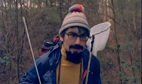
This shot shows one of the band members using a fishing net to try and catch the monster, we are also using a fishing net as one of our props.
This is a shot of the monster's foot. We will not be including a shot of the monster's foot in our music video, but we will be showing a footprint that the band find when they are searching for the cookie monster.
As we are making a music video for this song we took major influence from the official video, without copying it exactly.

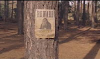
This shot shows a wanted poster of a monster pinned to a tree, we've used the idea of a wanted poster but in our video it gets posted through the door.
This shot shows one of the band members using a fishing net to try and catch the monster, we are also using a fishing net as one of our props.
This is a shot of the monster's foot. We will not be including a shot of the monster's foot in our music video, but we will be showing a footprint that the band find when they are searching for the cookie monster.
Thursday, 20 October 2011
Moodboard

Tuesday, 4 October 2011
Primary Audience Research
This is our primary audience research using 5 participants asking about our chosen genre of indie, we wanted to gather information on other peoples thoughts on the genre. We established the particular kind of dress a indie style of person would wear, this includes jumpers, skinny jeans and plimsolls. We found out that people like narrative and performance based music video's but also found out that the typical props in the indie genre is a band performance which in including guitar's, drums, bass guitar's and keyboards. Indie style of clothing also consist of wearing sunglasses even though its not even sunny. So in our music video we will adapt these features to it and use the costumes and props which have been said in this short video on primary audience research such as skinny jeans and jumpers; we will also have the use of instruments of a typical band of guitarist, drummer, bassist, and a singer so we will incorporate this in our music video.
Monday, 26 September 2011
Wednesday, 14 September 2011
9 screen analysis 3

Wednesday, 29 June 2011
Digipak Analysis 3

The artwork is made of images from the DVD footage, but the images have been faded and the brightness has been increased. This is effective as it looks good and makes it much clearer to see the big bold band name that stands out against the light background. This style is also employed on the inside of the cover, the back of the cover and on the actual discs. This design of packaging is useful because it shows off the band's great live performances as well as giving the target audience a preview of what to expect from the product.
As expected, the band's name is the biggest piece of text on the cover. The text is in a font unique to the band and has now become one of their common logos, meaning that it will stand out and is easy to spot for the fans. The text below the band name is in bold and capitals, therefore it still stands out and is easy to read without taking attention from the band name.

The back cover's background has an image of the live footage, but had not got as much effect on and is still quite dark, making it hard to read the track listing that is overlapping it. If i could make one improvement on the packaging it would definitely be fading and brightening the background image more. The packaging has followed typical conventions by putting the bar code and record label(s) on the back cover.
Tuesday, 28 June 2011
Advert Analysis 3

Subscribe to:
Posts (Atom)