Friday, 25 November 2011
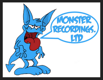
Final Company Logo
This is our final company logo. As we found out it would be included on our digipak, we thought it best to edit the colours to suit the package design we plan to use. There was also a few rough edges that needed neatening up and editing in order to make the logo look more professional, and something that would actually be used in the music industry, we have chosen the colour blue to suit the cookie monster theme as its the colour of the cookie monster and this blue, white and black colour scheme will be used throughout to show consistency within the products and will be considered professional in the music industry.
Subscribe to:
Post Comments (Atom)

No comments:
Post a Comment